Hello Friends,
Happy Friday! Can you believe it’s March? Spring is right around the corner and the lush colors that represent this season will follow. Pantone released their Spring/Summer 2018 palette which is a great mix of bolds, pastels and almost neon hues. These will be fun additions to your wardrobe, home accessories and decor.

Continuing our conversation on the basics of color and the upcoming season change, let’s talk tertiary colors, tints, tones and shades.
After our basic color wheel of Red, Orange, Yellow, Green, Blue and Violet, we then mix each hue with its bordering neighbor the create to tertiary hues. This brings our color wheel to a total of 12 colors. Using our neutrals of black, white and gray, amazing color combinations can be achieved. The possibilities are nearly endless. These tertiary (or 3rd tiered colors) are always named starting with the primary hue identified first, such as Red-Violet or Blue-Green. See the visual example below.

Remembering that neutrals (Black, White & Gray) are always our friend, let’s talk about tints, tones and shades.
These terms are often used interchangeably or out of context. Here are their real meanings when referring to color:
A Tint is when a hue is mixed with White – For example, Pink is a tint of Red.

A Tone is when a hue is mixed with Grey – Pantone’s 2017 Fall color, Golden Lime is a tone of Lime Green. There’s just a splash of gray that warms this color just right for fall.

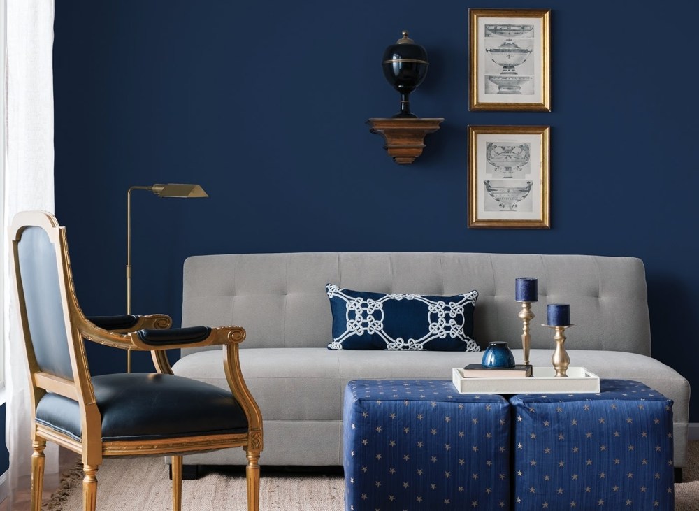
A Shade is when a hue is mixed with Black – My favorite example of this is Navy Blue. Navy is a shade of Blue.
Think about the ways that you can incorporate tertiary colors, tints, tones and shades into your wardrobe and home decor this Spring. Don’t forget about complementary hues as well which I covered in my last post here.
Perhaps you are wearing a red blouse. Try pairing it with pink pants or a skirt. Wearing a bold blue dress? Try an orange chunky accessory to complement it. Mix tints and shades. Accent a navy sofa with soft blue throw pills. Decorate a black and white themed bedroom with accents of violet and lavender.
There are so many ways to play and use color. Get creative and have fun! We’ll continue to discover the basics of colors as we move into room design and layout. Prepare for a styled and colorful 2018!
With Colorful Love,
-Tina B.

Thanks for this post – it’s very useful to have the right terminology! Very informative 😊
LikeLike
Thanks, Olivia! Glad you found this useful. Be sure to check the other two posts from this series if you have not already. Cheers!
https://lifestylewithtinab.com/2018/01/19/2018-b-styled-series-basics-of-color/
https://lifestylewithtinab.com/2018/01/05/2018-b-styled-series-live-in-color/
LikeLike